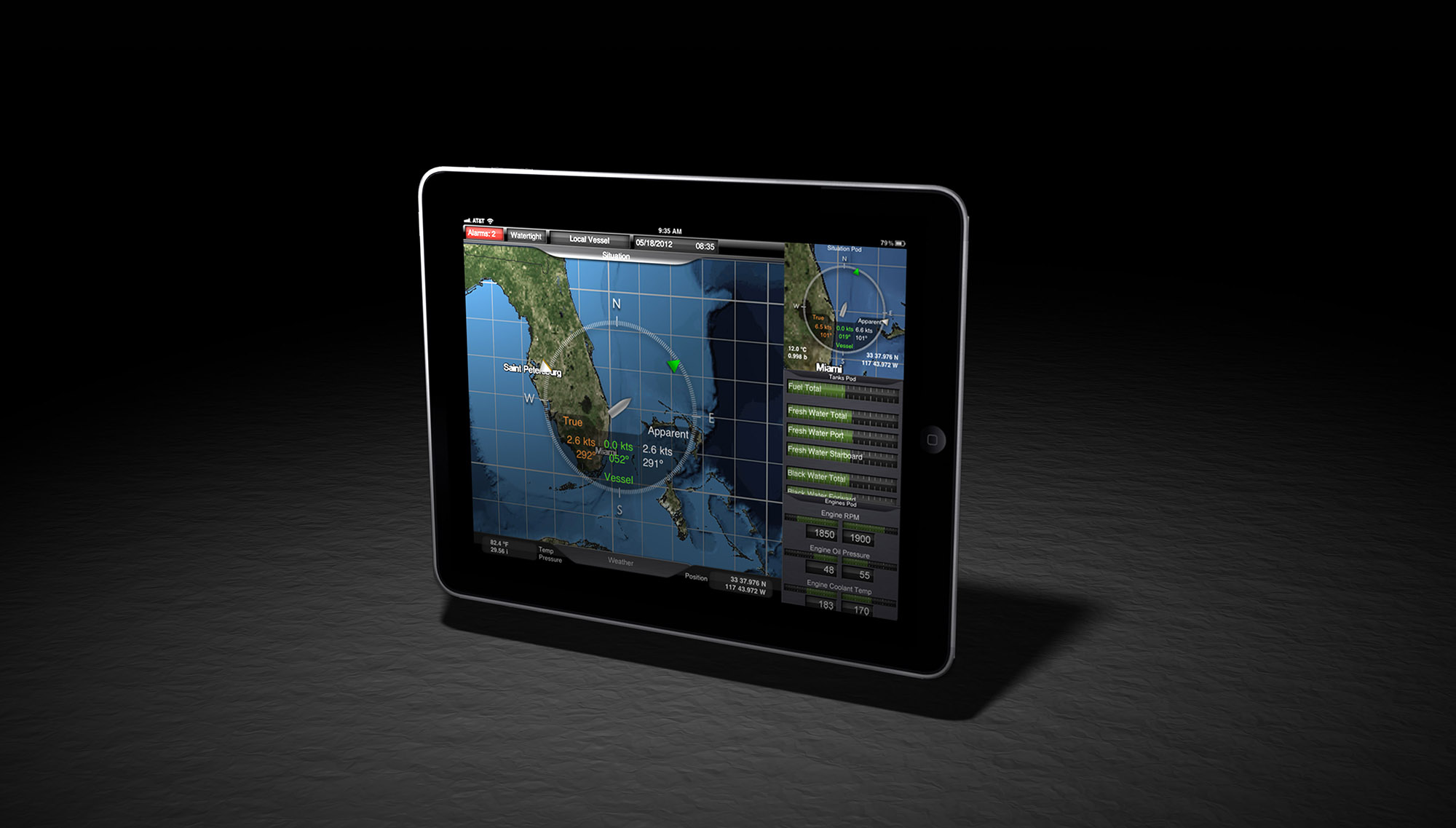
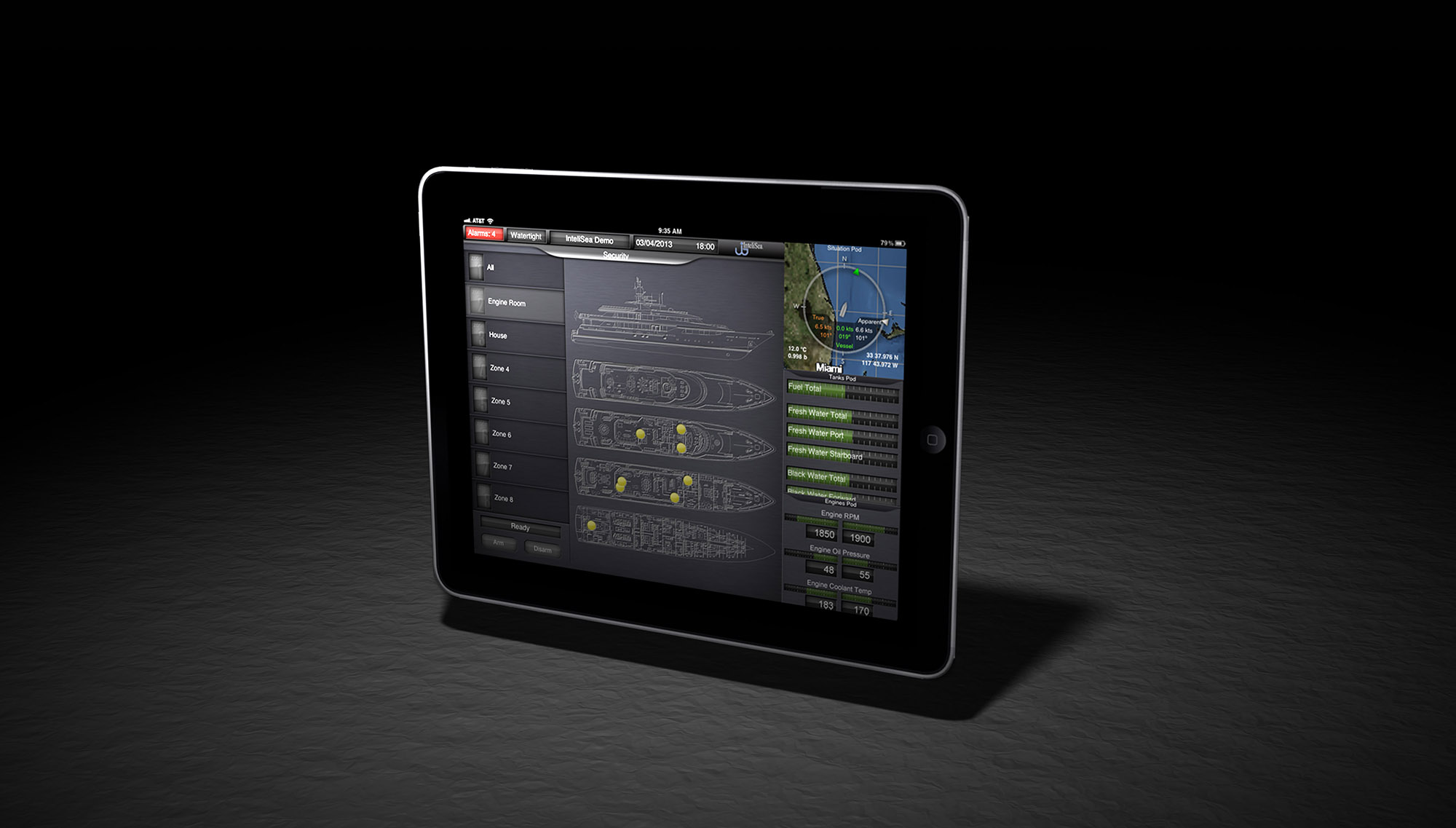
The iPad app furthers the original mobile design goals established with the iPhone app.
All screens are built upon a fundamental design consisting of a square main area and three smaller square "pod" sections.
Pods are user-selectable mini-screens, allowing the user to monitor three additional screens while keeping the most important information full size.
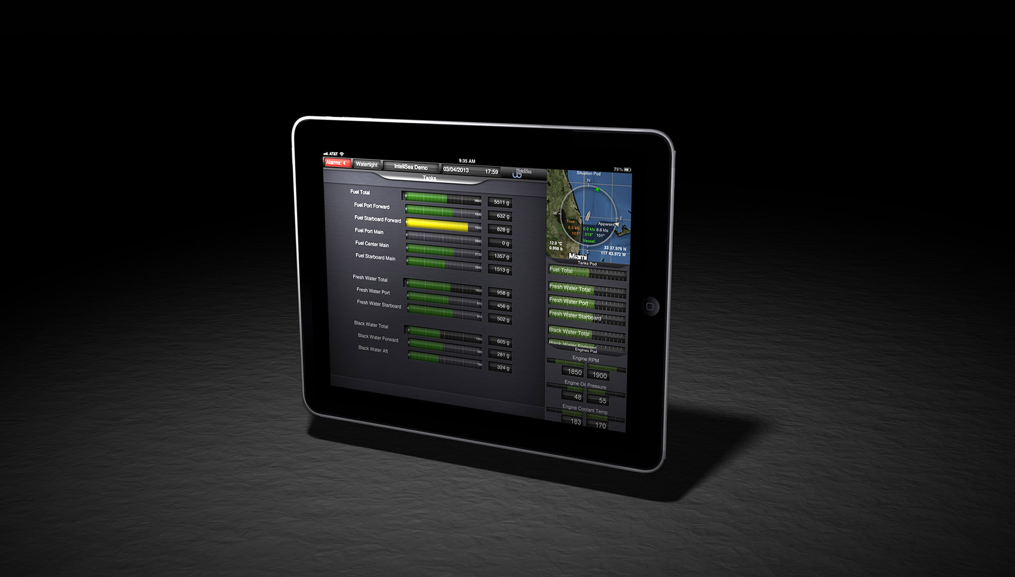
It is hard to believe that so much information can be neatly and cleanly presented on a single screen.
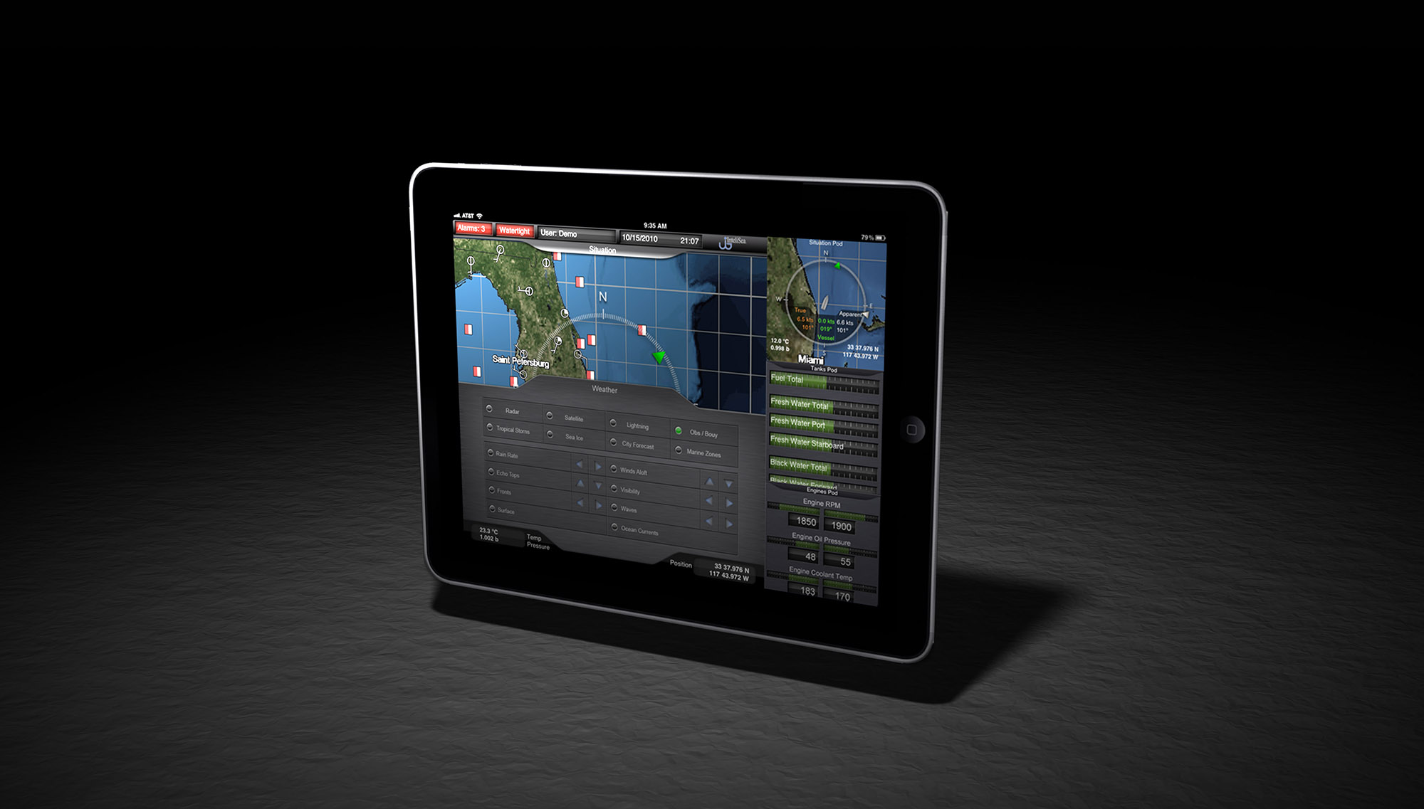
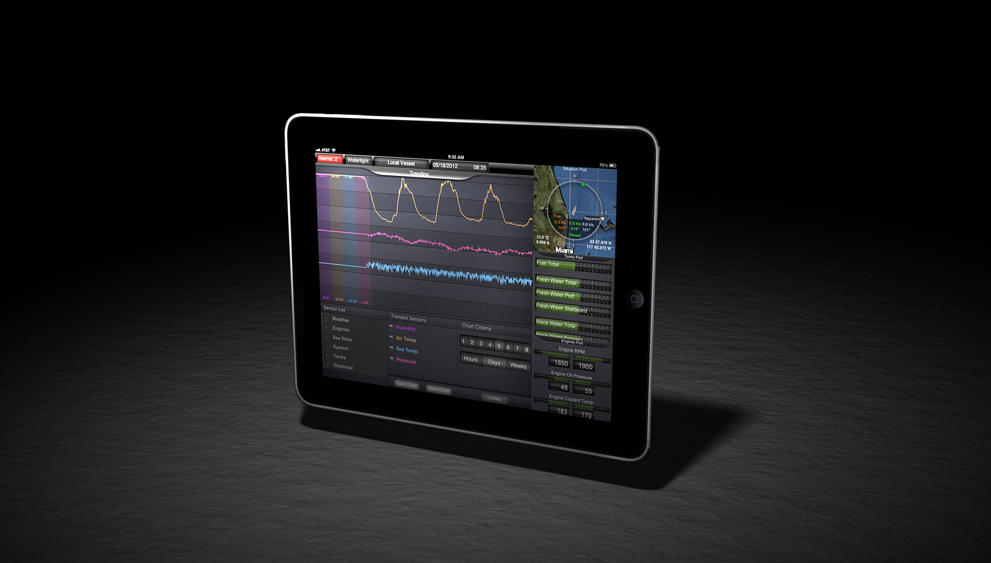
Additional chart overlay options are contained within the slide up tab (shown).
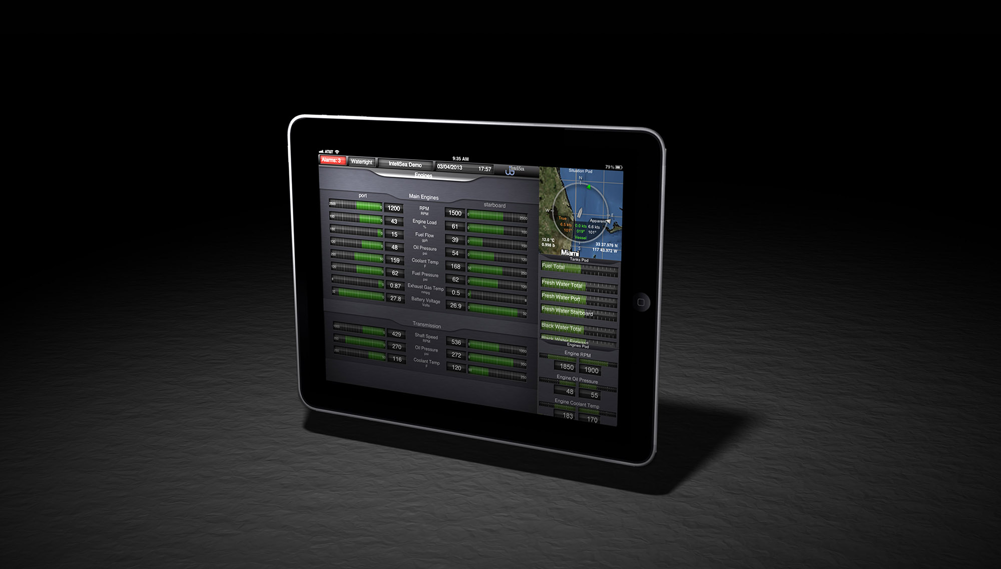
The values indicated here are shown on tape gauges with the origin of both columns in the center of the screen.
The symmetry of the gauge indication is easy for the human eye to understand and any anomalous values are easily noted.
Red, yellow and green indication further eases the burden of monitoring.
Careful Study of human cognition drove the design of clean, attractive indicators that can be understood at a glance.
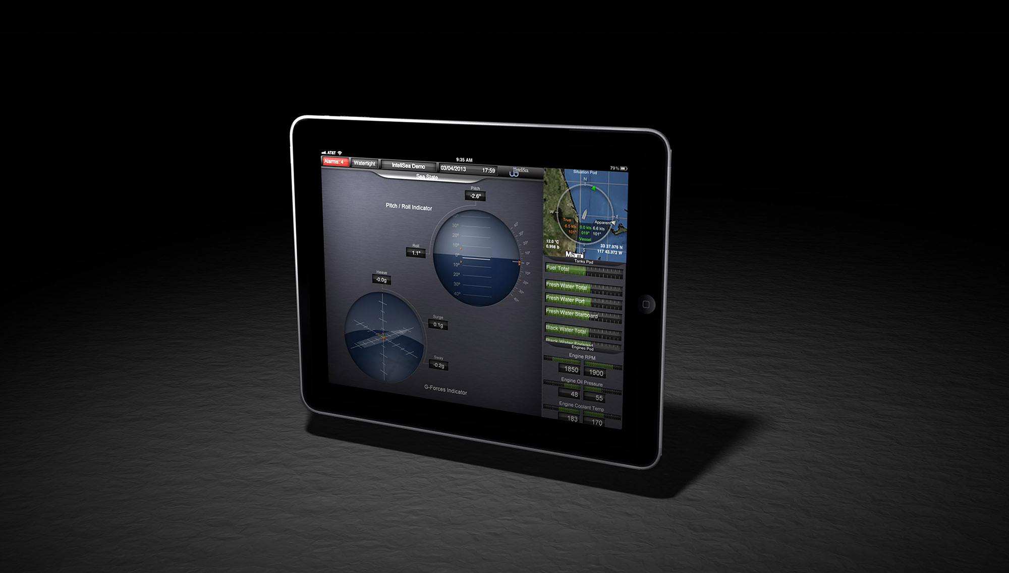
As simple to use as a home security system. Even if your home is a $20 million superyacht.
Again, Red, Yellow and Green provide instant understanding, meeting the goal of effortless situational awareness.
Visualizing user-selectable data in a useful side-by-side comparison.
7 - 7