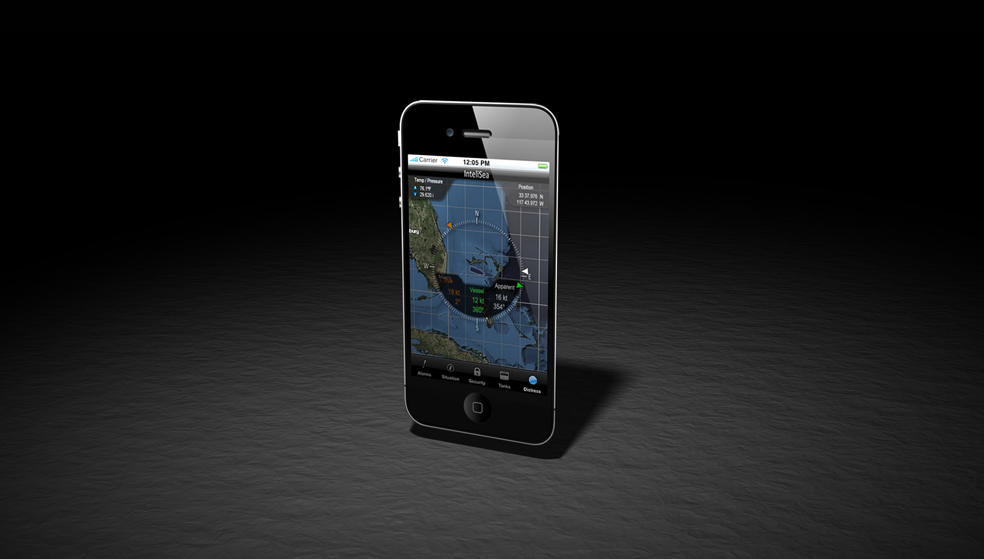
Complete situational data presented on a clean uncluttered screen - all sitting atop a nautical chart that can be dragged and zoomed.
The design intent from the very beginning - clean, elegant graphics and simple, intuitive functionality.
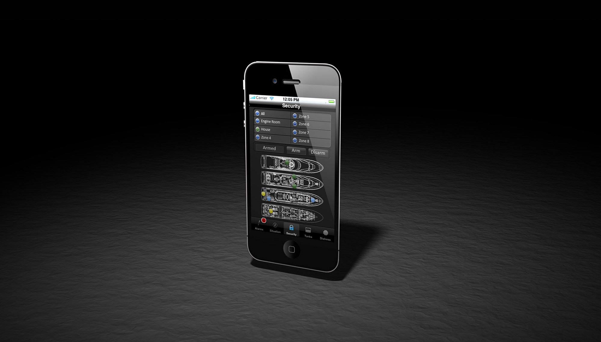
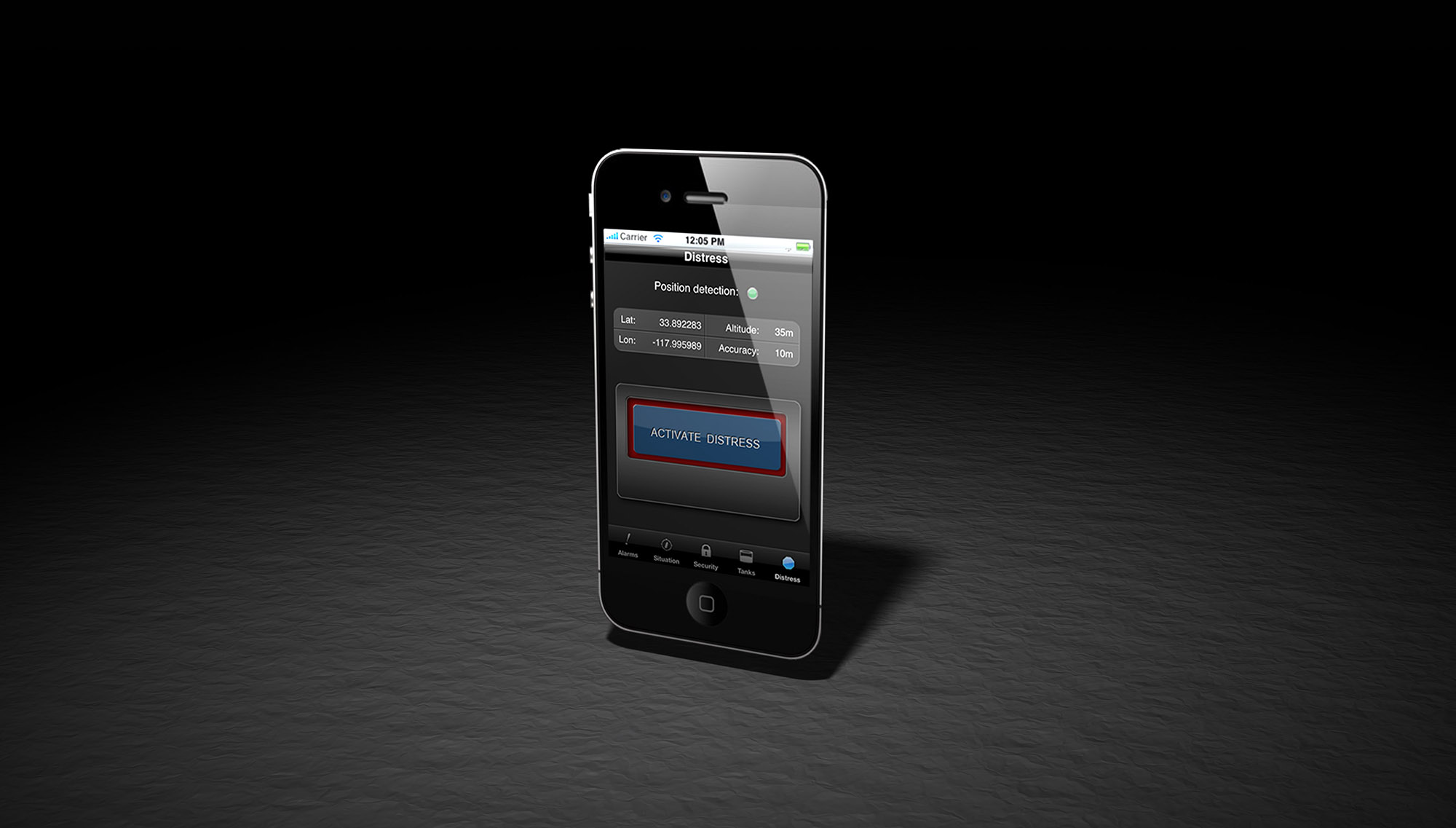
Again, clean and simple. As easy to use as a home security system.
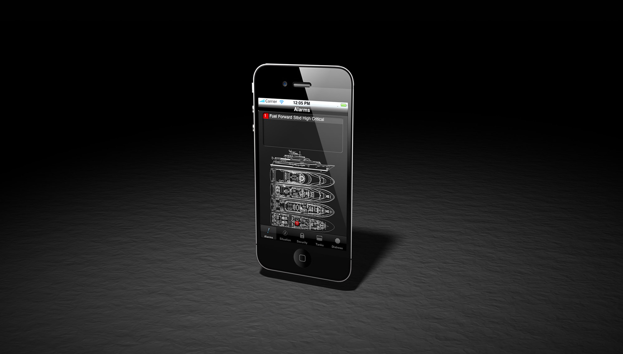
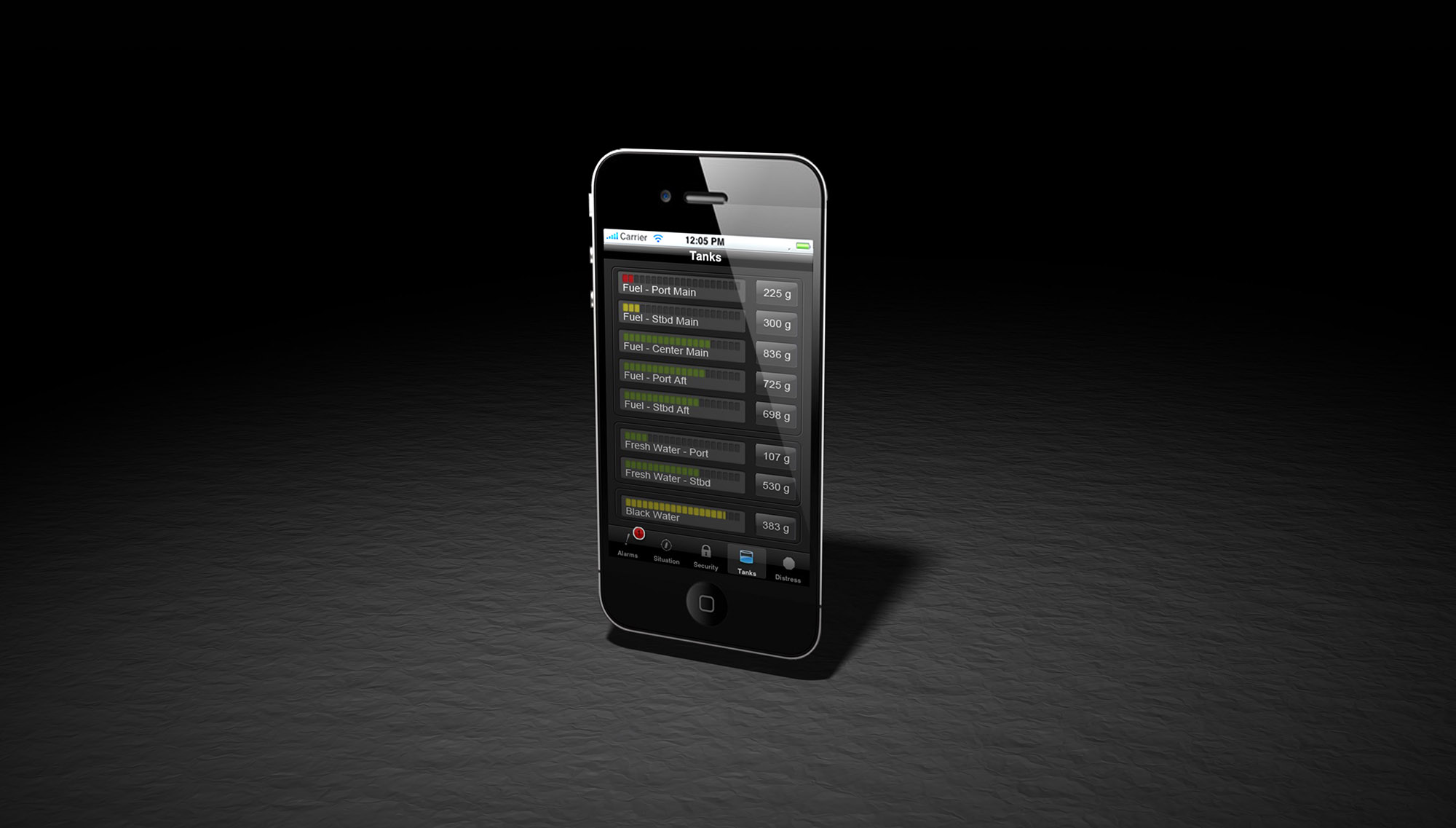
The use of the colors Red, Yellow, or Green immediately highlight any anomalies.
These three colors are not used in any other context throughout the UI - drawing the eye and demanding attention.
Simple, clean functionality.
1 - 5